 Before you begin please double click on the “Collegian” drive. In it, there is a folder called “InDesign Tutorial.” Right click and “Copy InDesign Tutorial.” On your desktop, again right click to “Paste Item.” The InDesign Tutorial folder should now appear on the desktop. Please note that the Macs in Shima 203/204 are in “Deep Freeze.” Any work you save to the desktop will erase upon shut down or restart. All work you want saved should be placed on the Collegian drive.
STEP 1: Opening InDesign
Double-click on Macintosh HD on your desktop. Then click on “Applications.” Adobe InDesign CC 2015 will be included in the list. Double click it to load. InDesign will load with a pop-up window in the middle. Exit out of that pop-up window.
STEP 2: Creating a new document
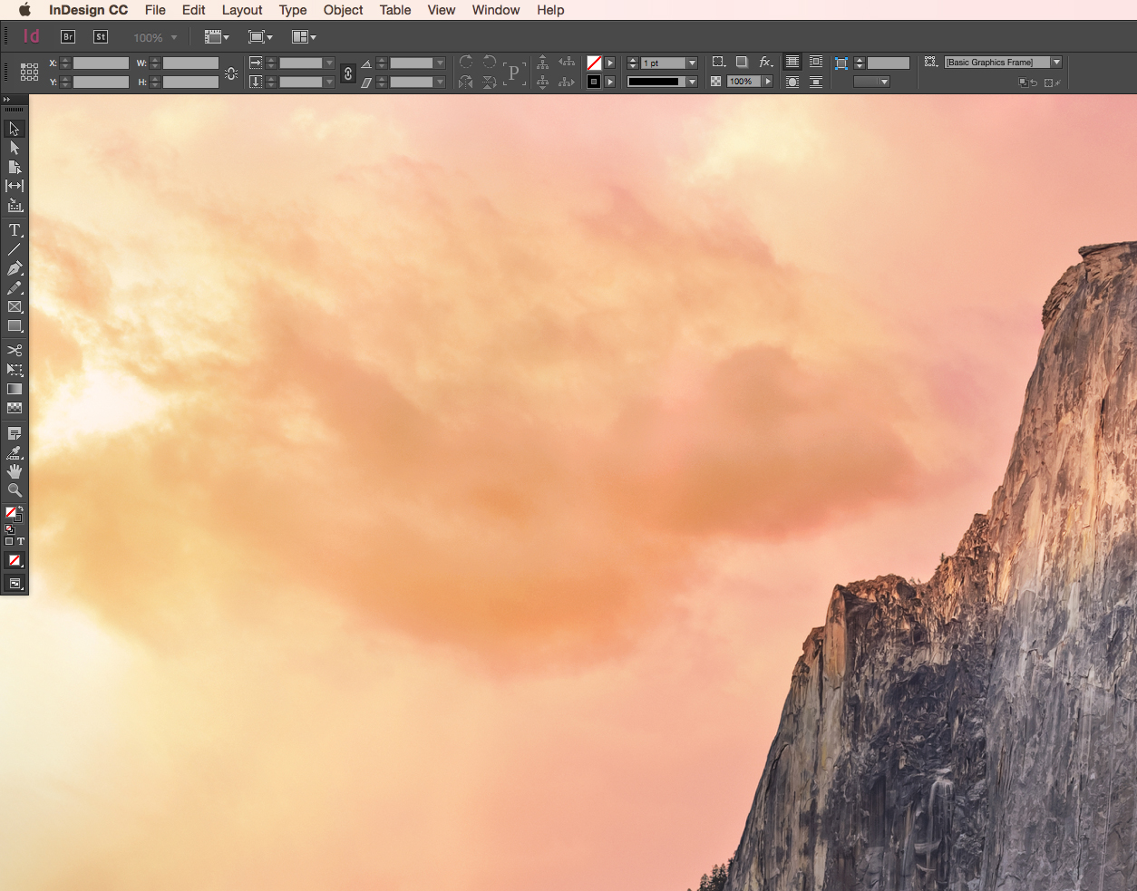
Your screen should look like this:

Hover to activate File>New>Document.
Click “Document.” A new screen will appear.

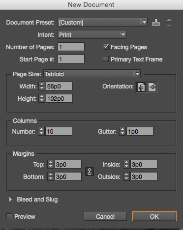
You’ll notice that you can change parameters for this tutorial document. Do so. Please use the following:
Page Size: Tabloid
Columns: 10
By default, InDesign sets to “Picas” as units of measurement. You may not want to use “Picas,” though you should know what one is. You can change the units to inches by selecting InDesign CC>Units & Increments.
NOTE: A “Pica” is a size of letter equal to that of a typewriter. In early journalism days, this was the easiest way to determine space.
There’s a “Preview” button that will give you a preview of the page if you’d like to see it. It should look like this:

If your page looks like that, click “OK.” The new page will display without the “New Document” pop-up box.
NOTE: Workflow
- Normally your page will have some sort of a topper, only two empty pages in the paper, but both are connected to another page
- As an editor, your pages are prepped for you because ads are sometimes slotted on the pages before hand
- Ads are determined by what stories are turned in, if someone is turning in a story, even on early Tuesday morning, it’s likely space won’t be held for that story
STEP 3: Saving
You will need to do an initial “Save” on your document. For the sake of this tutorial, please “Save” your work with your name on it to your “InDesign Tutorial” folder that you moved onto your desktop. You want to make sure you are saving your work at regular intervals. There have been cases of editors designing entire pages and never saving, losing all the work.
STEP 4: Opening Shapes
The Collegian comes together thanks to a gallery of “Shape Items” already inputted the templates. You each have a copy of a Shape library in your “InDesign Tutorial” folder.
Open it by navigating to the following: File>Open>Desktop>InDesign Tutorial>Collegian Shapes
The shape box will appear:
 A box containing “shapes” will open. These are preset shape and design elements that fall within the “style” of The Collegian student newspaper. Our style stays the same from page to page, which is part of the reason editors open pages from templates (see “NOTE: Workflow” above).
Style is part of a newspaper’s identity. You can drag any of these items to the page and see what they look like. In a few cases, there are also layouts you can drag to the page. This isn’t an easy fix, though. Content still has to be placed within those shape “modules.”
A page with “shape items” placed:

STEP 5: Drawing a box

Click the “Rectangle” tool to activate it. A cross-marked cursor will appear on the screen. Click the mouse and hold to see a box start to form. Draw the box as large or as small you’d like. Once you’re drawn the box to the size you’d like, release the mouse.
NOTE: You will still see the cursor marker. To get rid of that marker, click the “Selection” arrow. It’s the black arrow at the top of the same left-side aligned toolbox.
![]()
In the “Stroke” window, in the toolbar on top of the page, you can give the box a black outline. You can also change the color of the stroke, though we have limited color in actual print for The Collegian.
STEP 6: Placing a photo on the page
There are two ways to place a photo on a page. One involves taking the photo into Photoshop, cropping to actual dimensions and then doing a place. The preference of students in recent years is that the action of cropping the image typically creates issues when pages are being disassembled and then reassembled on the fly around deadline time.
It has become the staff preference to use Photoshop to remove color information, i.e. to convert to grayscale and to tone images. Cropping is now done in InDesign. That’s the method we’ll address here.
NOTE: You should always tone images and remove color information (if applicable) prior to moving a photo on the page.
Make sure you’re on the black “Selection Tool” and click the box you drew in Step 3. Once you’ve selected the box, navigate to File>Place. Navigate through your computer to the InDesign Tutorial folder. Select any one of the images in the folder.
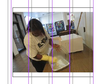
The image will likely appear pixelated:
![]()
It will appear that way because the image is coming in large format at high quality. Right click on the image. A box will appear with a “Fitting” option. Click Fitting>Fit Content Proportionally.
You may notice that your image may no longer fill the box you drew originally. You can change that.

Use the white arrow “Direct Selection” tool to resize within the frame. Click the photo, it will highlight in orange. If you touch any of the corners, you’ll notice that you can make the photo larger or smaller. You can adjust however you want to, but the image may move out of proper proportions. How do you know if it’s not proportionate? A person or element in the image may appear smaller than normal or exaggerated. If you feel you’ve messed up the sizing, correct your mistake by using the black “Selection Tool” and right clicking on the box/image. You will again see the prompt for Fitting>Fit Content Proportionally.
To avoid taking the photo out of proportion, hold the “Shift” key while you use the mouse to adjust the size of the image within the frame. Remember that the white arrow “Direct Selection Tool” is what changes the size of the image. It will not change the size of the frame.
To change the size of the frame, use the black arrow “Selection Tool.”
STEP 7: Placing and formatting a story
Similar to how you drew a box for Step 5, you will need to draw a box to place word content in. If your box has a line around it, remove it by clicking “None” for the stroke definition. Text boxes typically don’t have lines around them.
Once you draw a box, use the black arrow “Selection Tool” to select it on the page. Then go to File>Place and select a story from the “InDesign Tutorial” folder. It will place the content in the box.
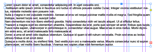
The text WILL NOT be formatted:

To format the story in standard Collegian font, go to Window>Styles>Paragraph Styles.
You will see a list of styles, including “Ragged Right” and “Body Justified.” Any story written in a news tone, with outside attribution and reporting, should be “Body Justified.” Opinion and entertainment stories are typically “Ragged Right” to denote the writer has a slant.
Body Justified:

Ragged Right:

Step 8: Setting columns in a story
The box width in Step 7 determined that the text would go across the page. That’s not how readers actually read stories. Instead, you can set “columns” in the story to break apart the text and make it more readable for viewers.
To set columns, right click on the text box. A list of options will appear, one will be “Text Frame Options.” Click it. Another box will display:

Set the column number to however many columns you’d like. This is really a design element. Putting a story in four columns across a page will likely look good. Putting a story in four columns across only half a page likely won’t.
When you click “OK,” your text should be evenly spread across four columns.

 NOTE: Columns can be added without opening “Text Frame Options” by changing the number in the column box.